Tick-marks for log10 axis
For the tailr post I needed to plot some benchmark results. I still haven’t figure out how I can get plots from RMarkdown automatically moved to the right directory here, but that’s okay. I can do that manually for now.
Anyway, I wanted plots like this one:
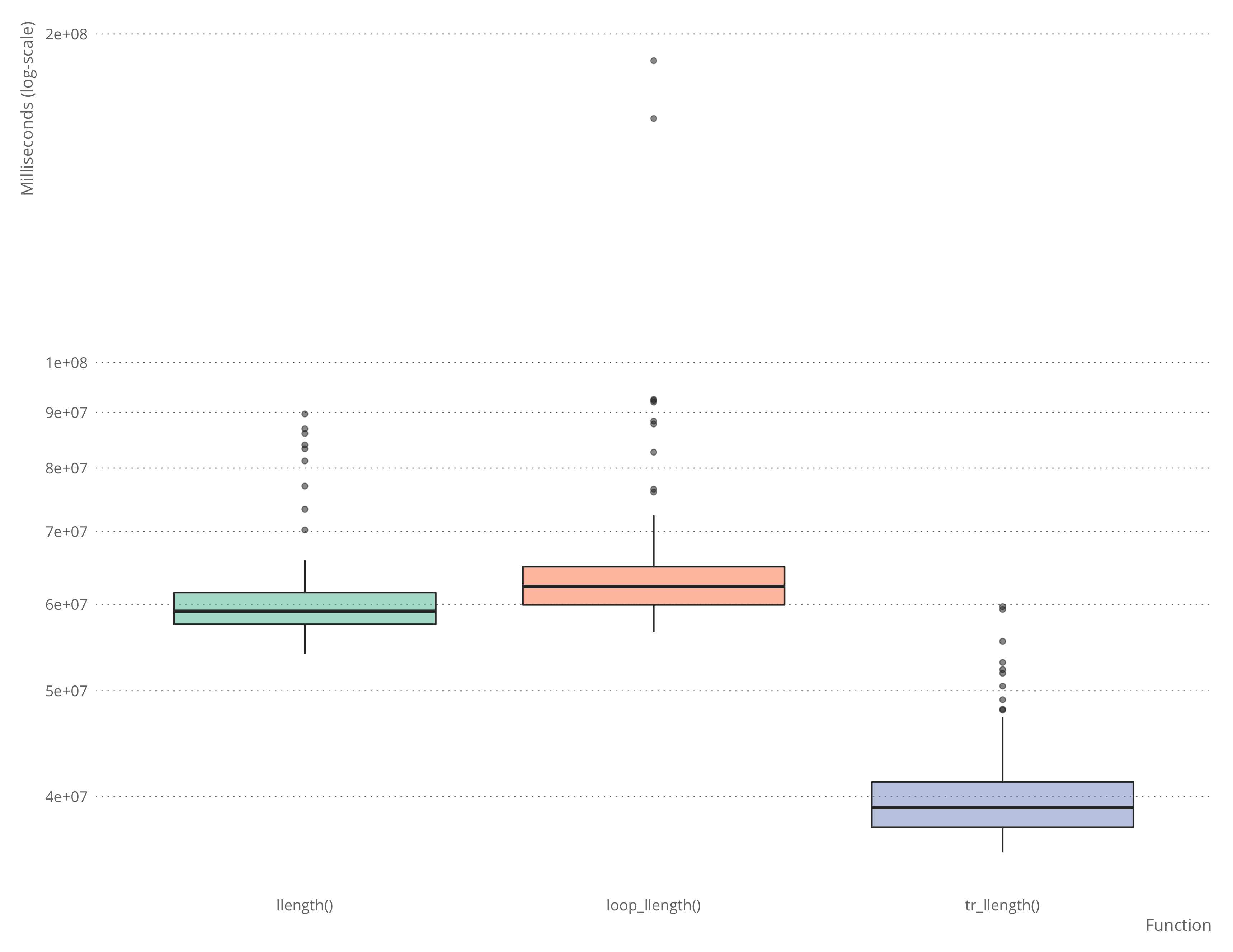
The default tick-marks on the y-axis, however, weren’t quite like I wanted them. I wanted them as shown in the plot above, with ten tick-marks per order of magnitude.
I am sure that this must be implemented lots of times, but I don’t know which function I should be looking for, so I ended up implementing it this way:
log10_ticks <- function(elms) {
    bottom <- roundDown(min(elms))
    top <- roundUp(max(elms))
    orders_of_mag <- log10(top) - log10(bottom)
    if (orders_of_mag < 0) orders_of_mag <- 1

    # it is slightly easier to compute it this way, where
    # I have some zeroes when changing order of magnitude
    # that I can just delete again later
    ticks <- vector("numeric", length = 10*orders_of_mag)
    m <- bottom
    for (i in 1:orders_of_mag) {
        for (j in 1:9) {
            ticks[10*(i-1) + j] <- m * j
        }
        m <- 10 * m
    }
    ticks[10*i] <- m
    ticks[ticks != 0]
}
I then used this function to set the break-points in scale_y_log10 like this:
ggplot(bm, aes(x = expr, y = time, fill = "#fc6721", alpha = 0.2)) +
    geom_boxplot() +
    scale_y_log10("Microseconds (log-scale)", breaks = log10_ticks(bm$time)) +
    scale_x_discrete("Function", labels = c("factorial()", "loop_factorial()", "tr_factorial()")) +
    xlab("Function") +
    theme_blog() + theme(panel.grid.major.x = element_blank(), legend.position = "none")